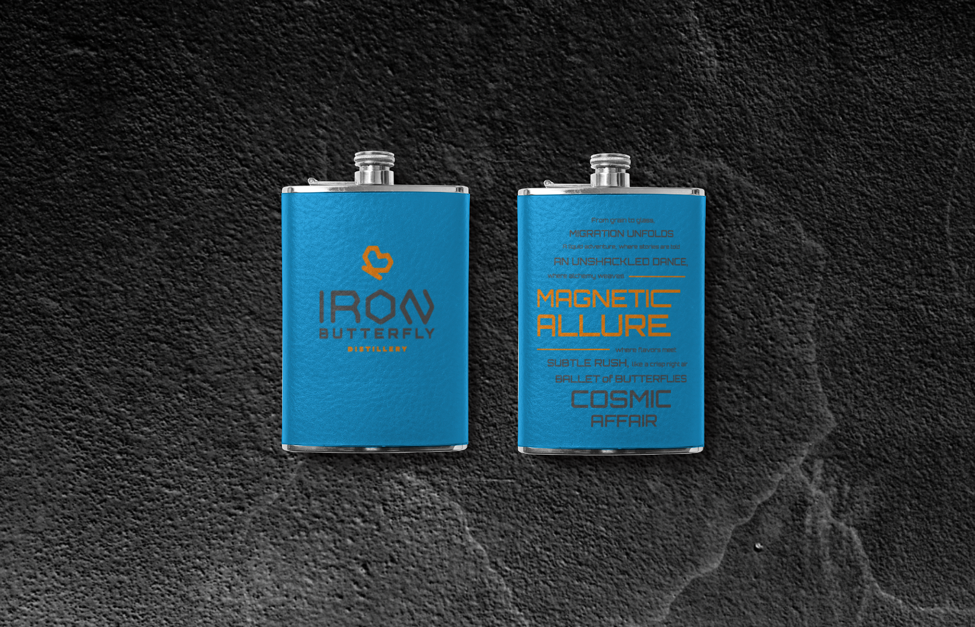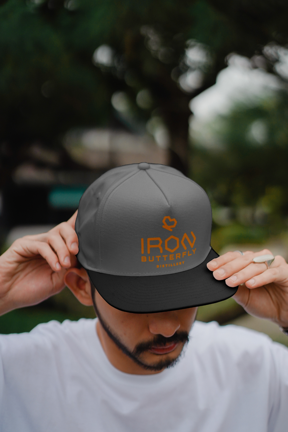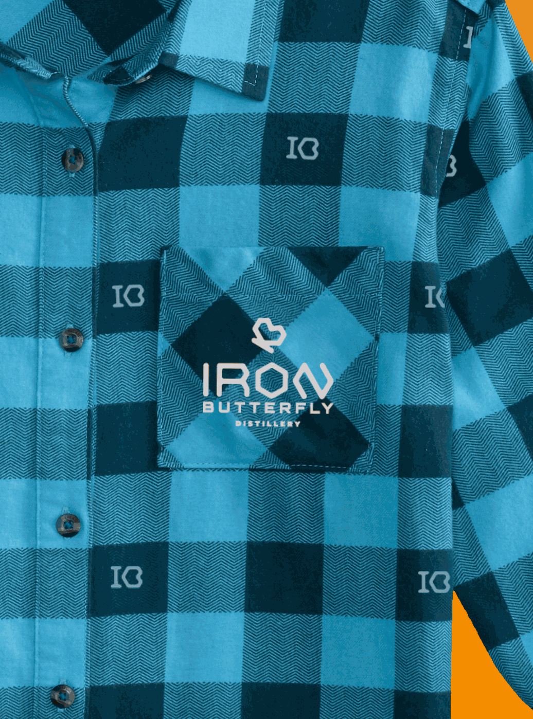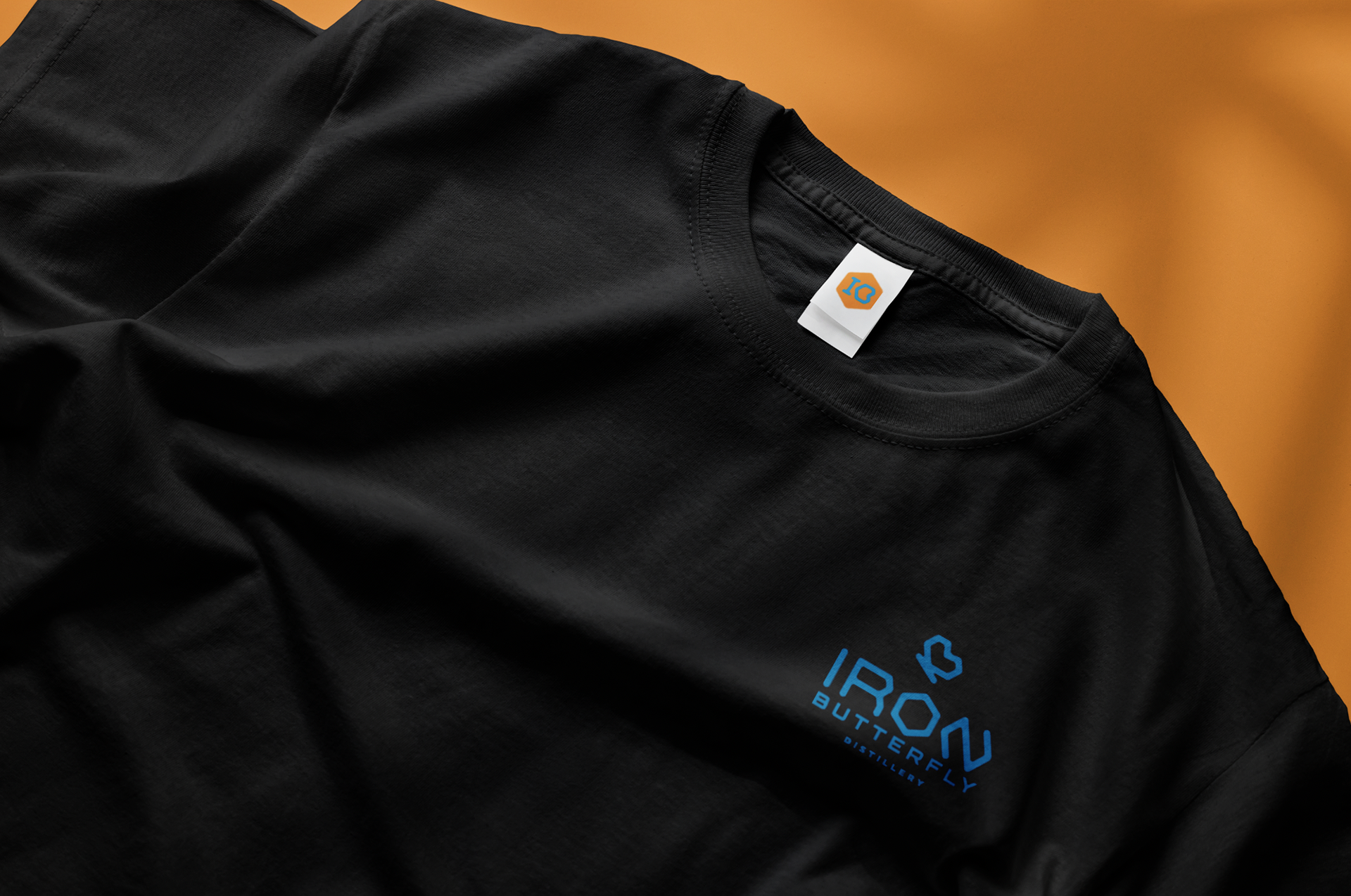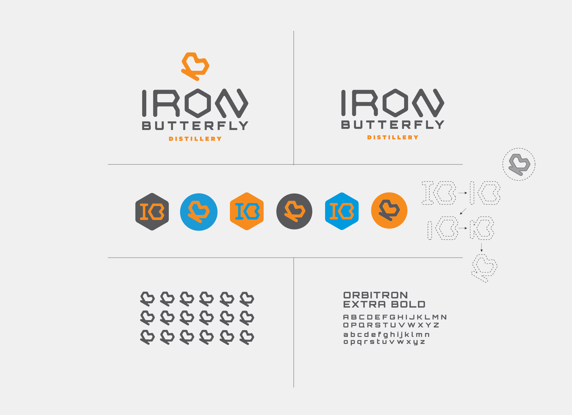
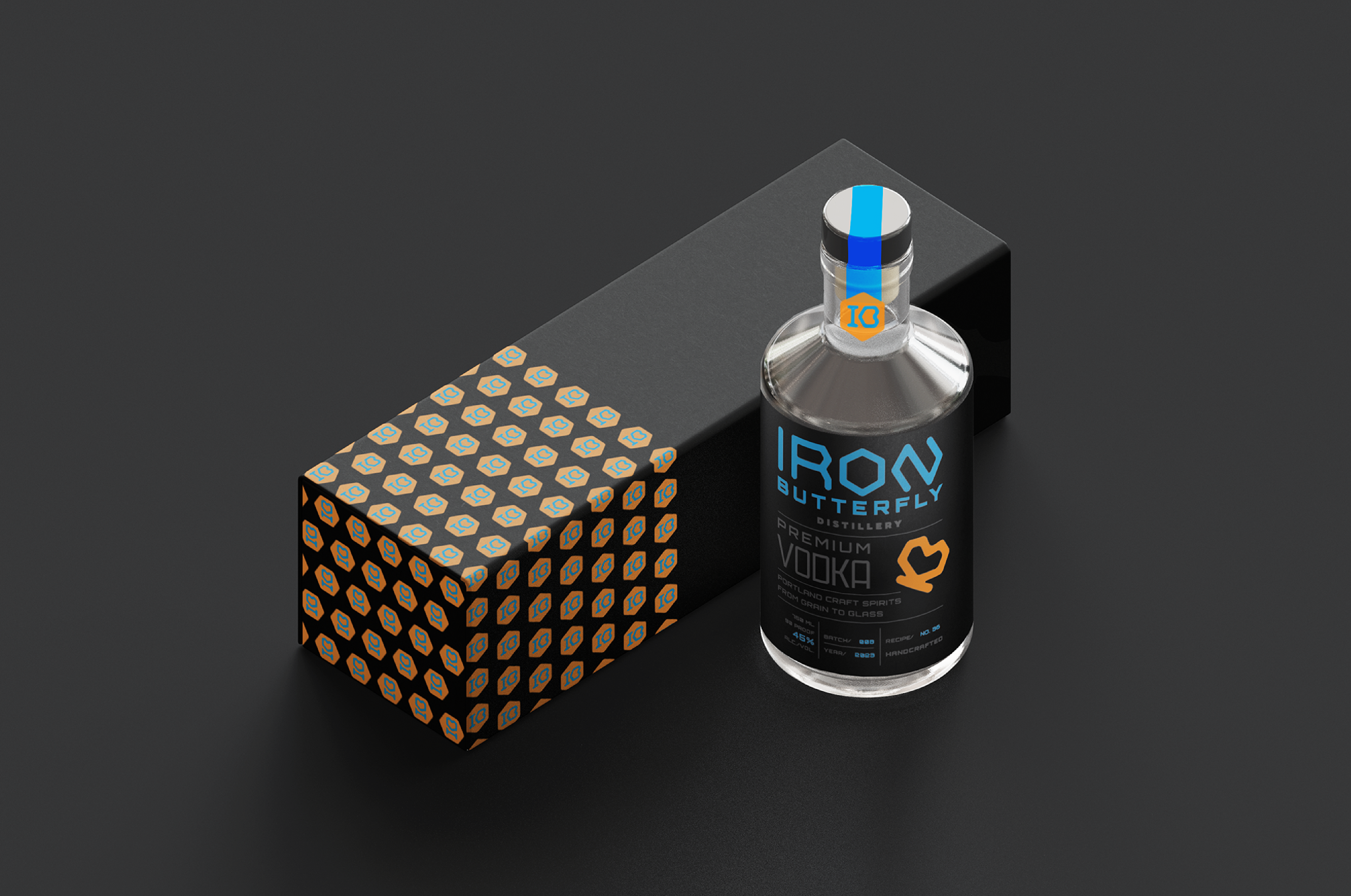
Iron Butterfly Distillery
Branding/Packaging/Trademark Design
Overview
The fruition of Iron Butterfly Distillery came about during the early part of 2021 and remains a local, hidden gem in Portland, Oregon. The distillery currently exists without it's own unique trademark or identity and, instead, gives prominence to their product line— Soda Joy; handcrafted Vodka seltzers with natural fruit flavors and zero sugar or preservatives. It is also important to mention that their seltzers are canned in house and are mostly sold at local farmers markets. In other words, IB is just getting started as far as brand establishment goes, but with their existing community engagement and attractive name, there is great potential for expansion.
Approach
While the distillery is taking strides in emphasizing their craft beverages, I have taken the initiative to expand upon the brand's identity as a whole. Starting with the creation of a trademark and packaging label specifically tailored towards the distillery itself, this ongoing effort aims to carve out a distinct and cohesive brand presence that further elevates Iron Butterfly's authenticity and the joy they bring to Portland.
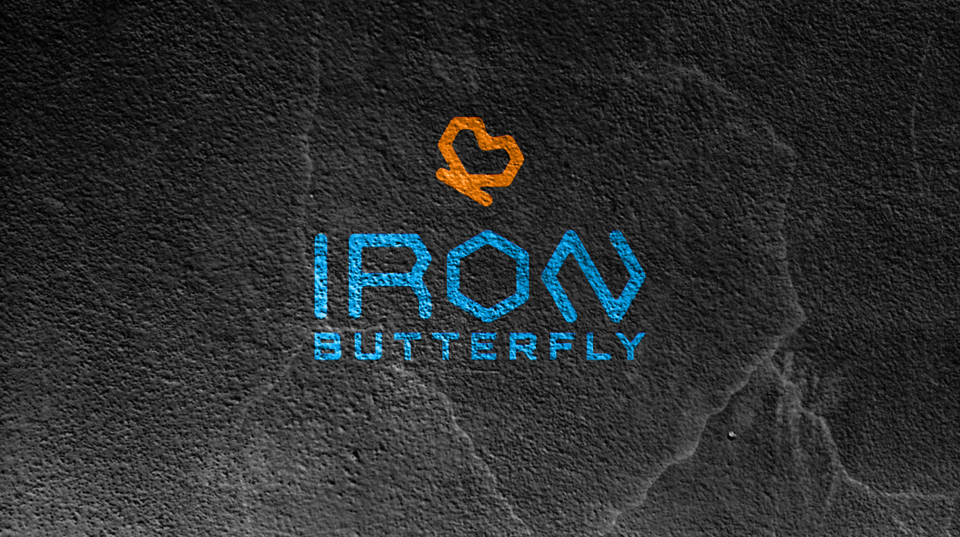


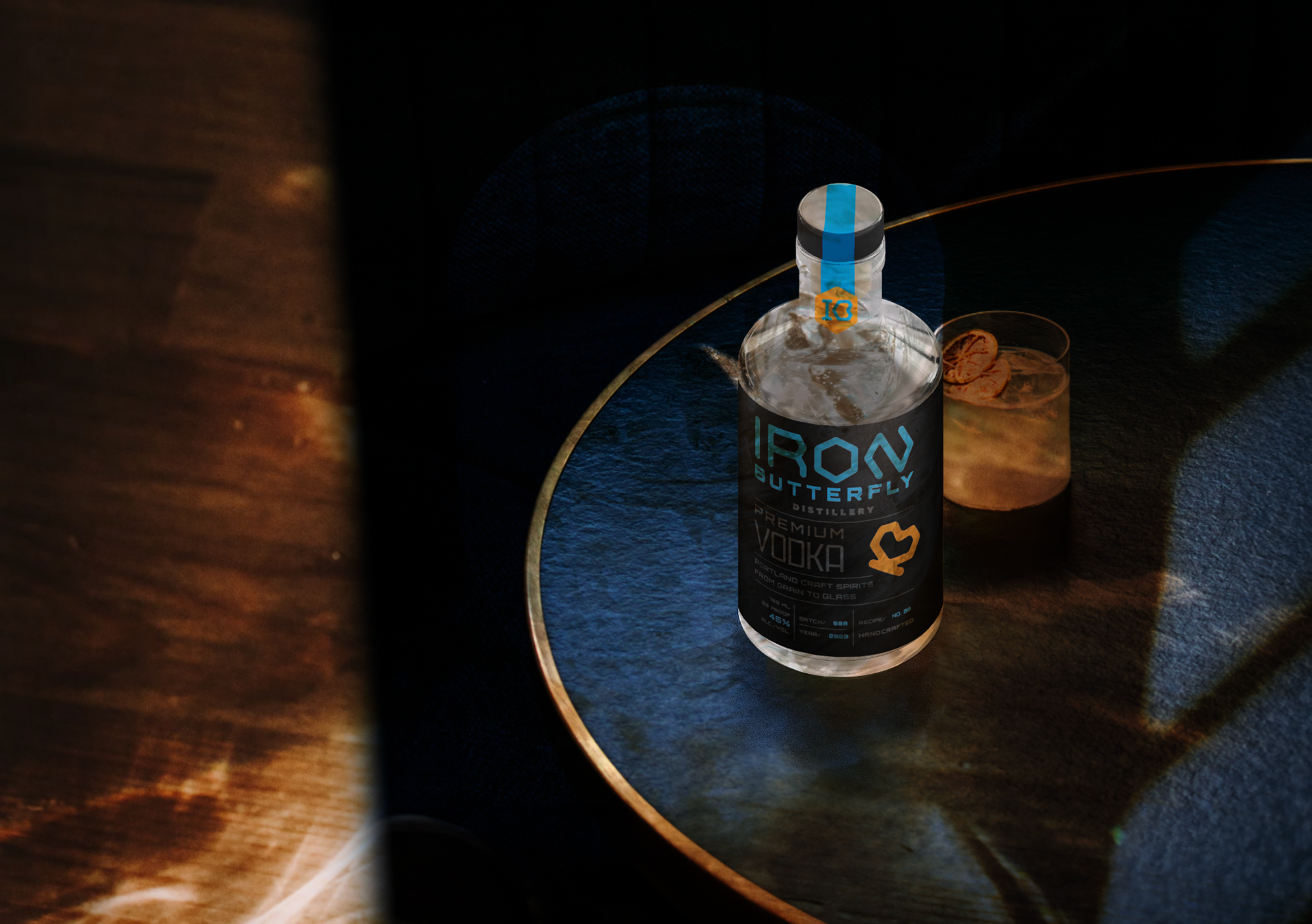
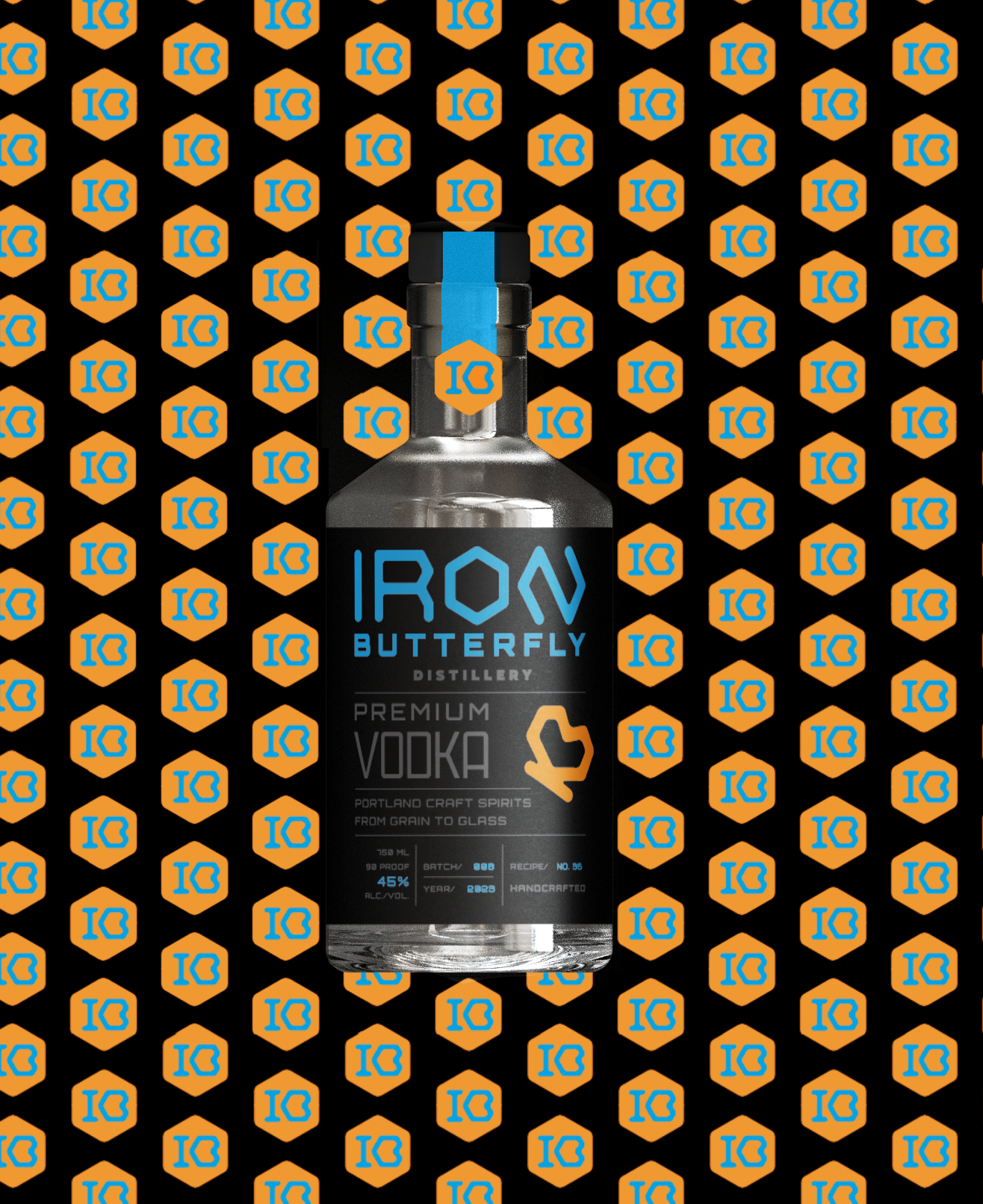
Iron Butterfly Distillery is still a work in progress, and I’m actively refining and updating it as I go. As a small, upcoming business, the journey has been both exciting and challenging— especially when it comes to defining the brand’s voice. There’s something paradoxical about the name itself, and that tension between strength and delicacy is something I’m still exploring. The brand’s identity is taking shape through its bold yet balanced colors—blue, orange, and grey/black—and while it’s still evolving, each step brings it closer to something truly unique.