
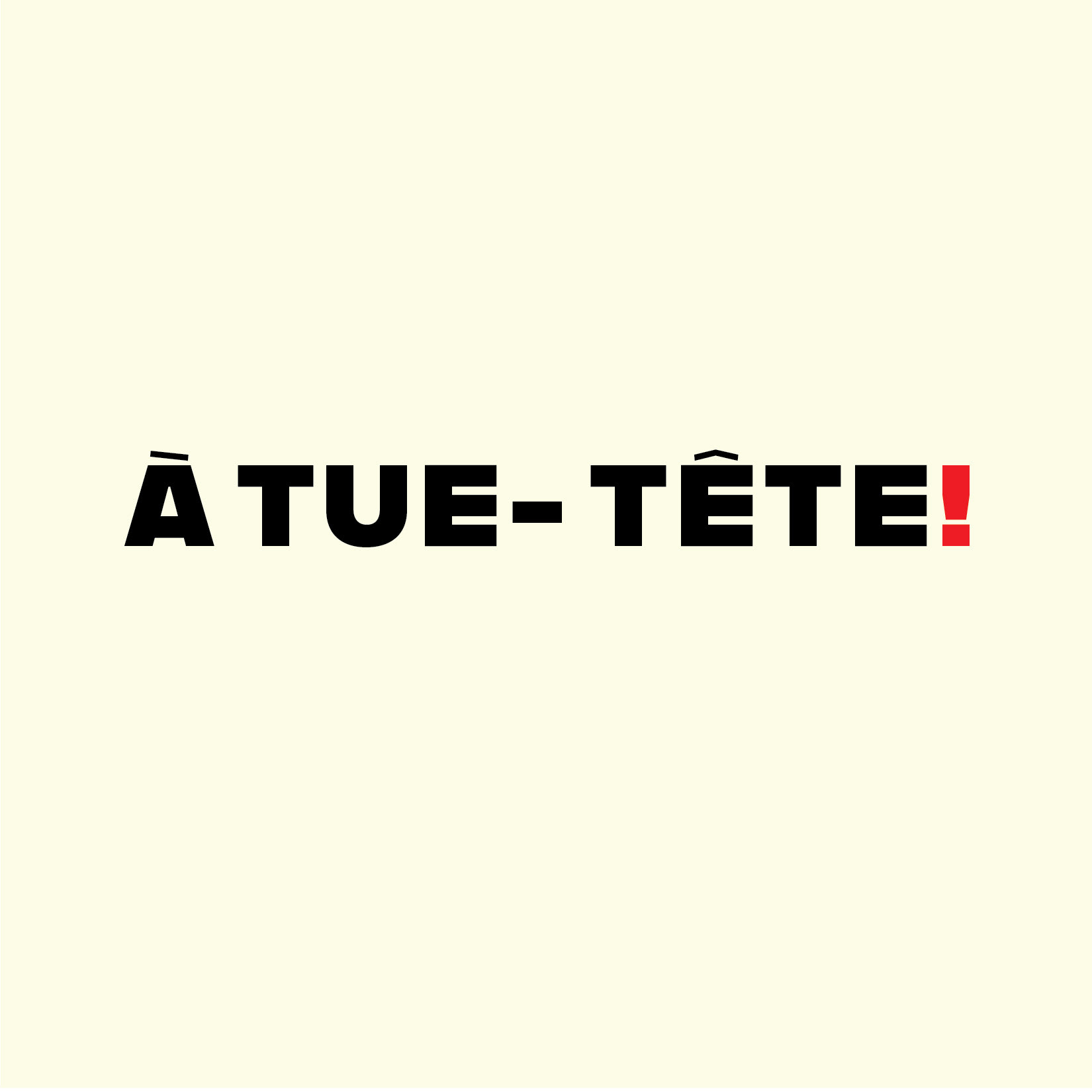
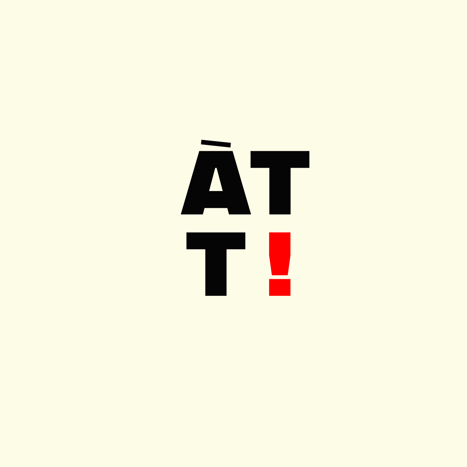
À tue-tête! Brewery
Art Direction/Branding/Packaging
Overview
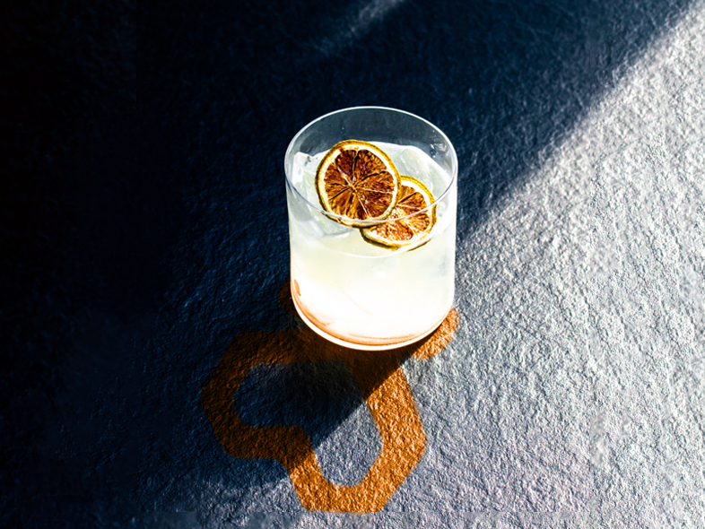
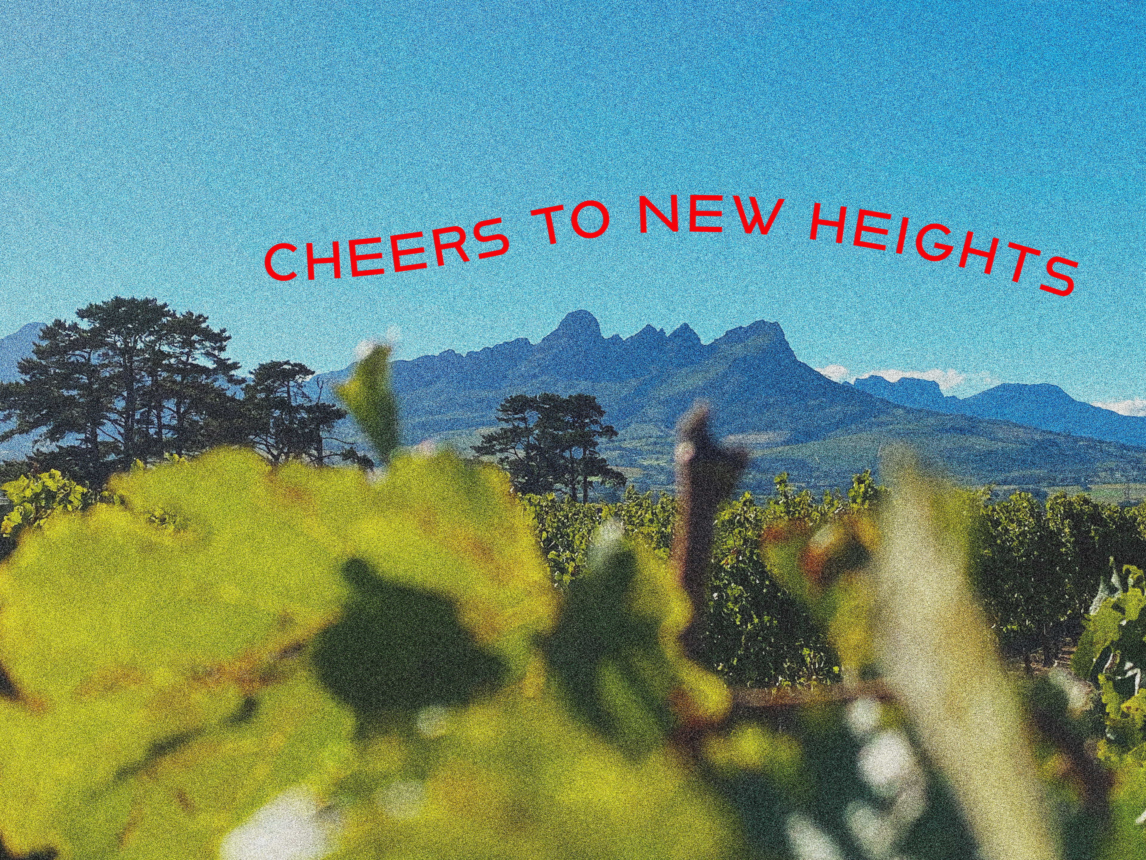
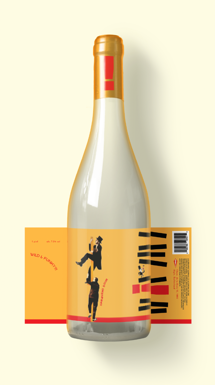
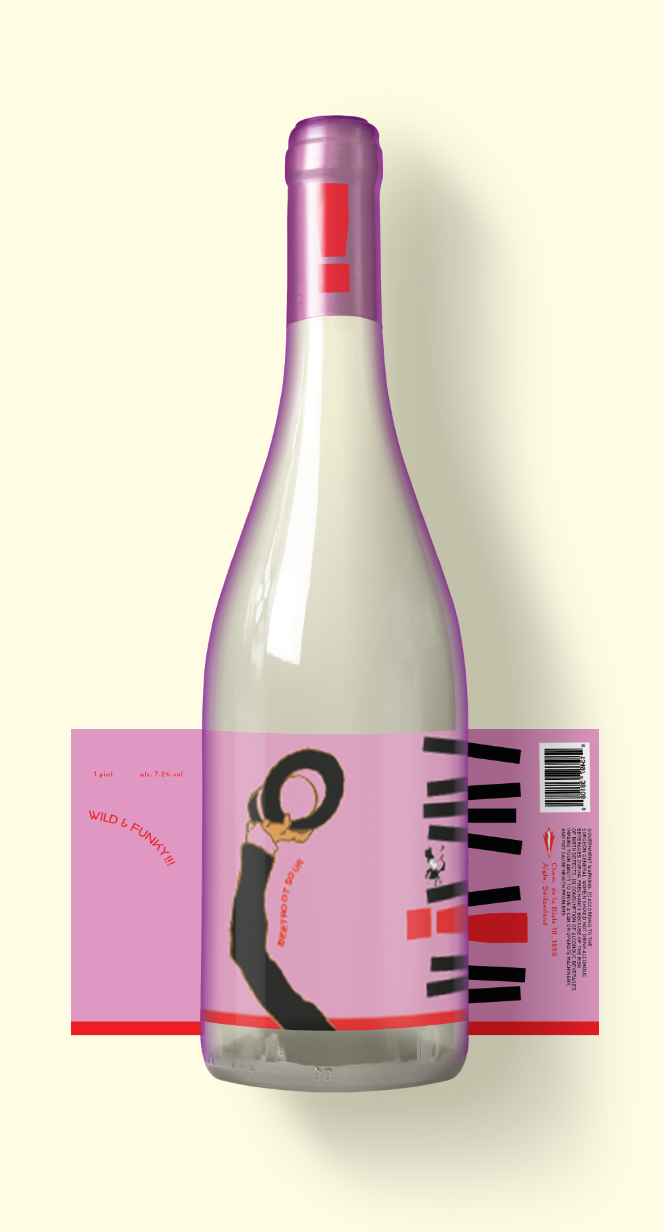
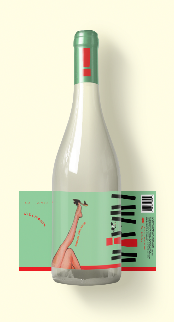
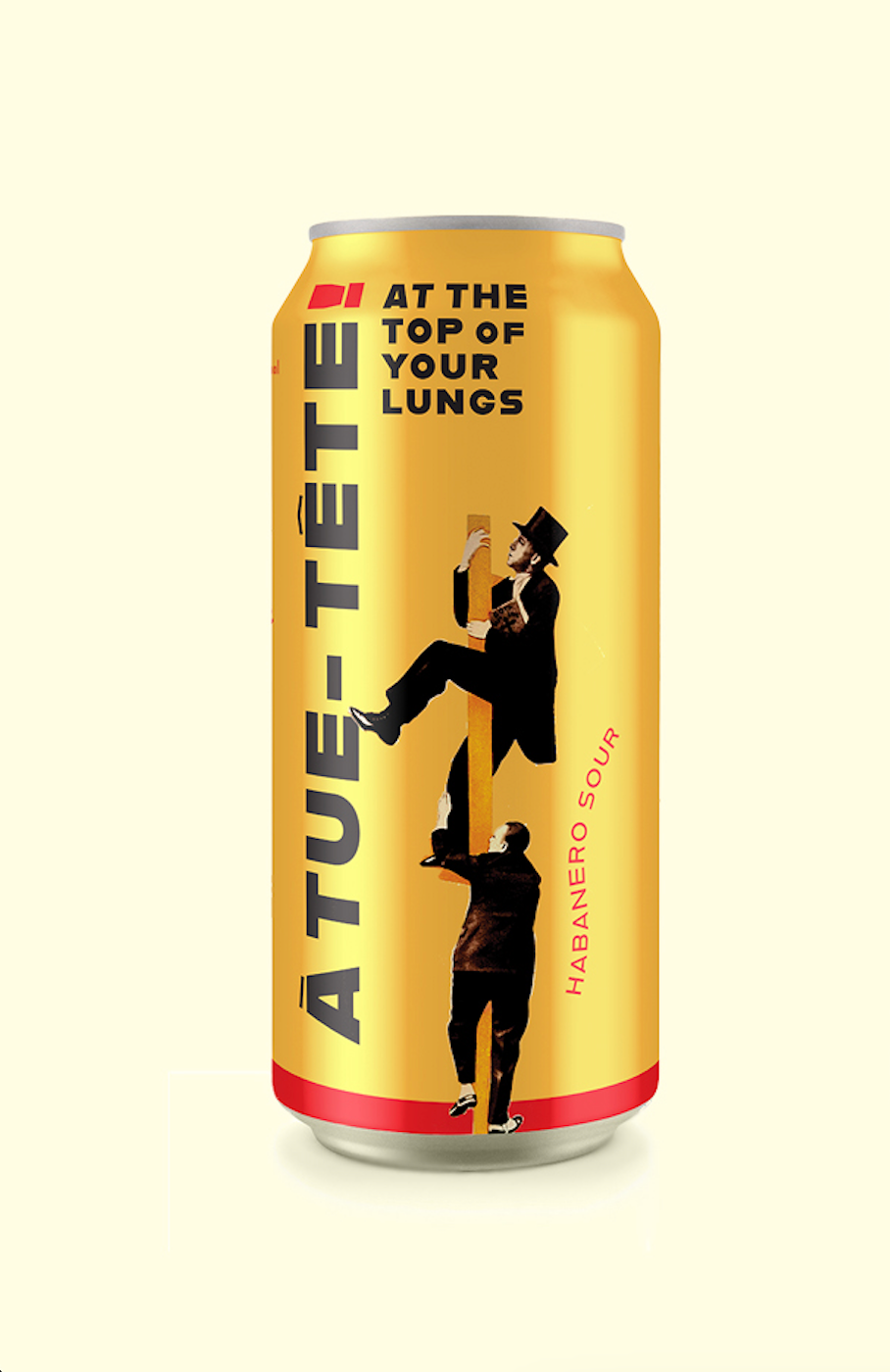
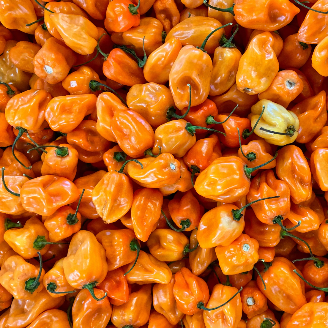
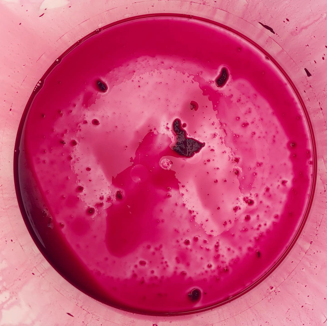
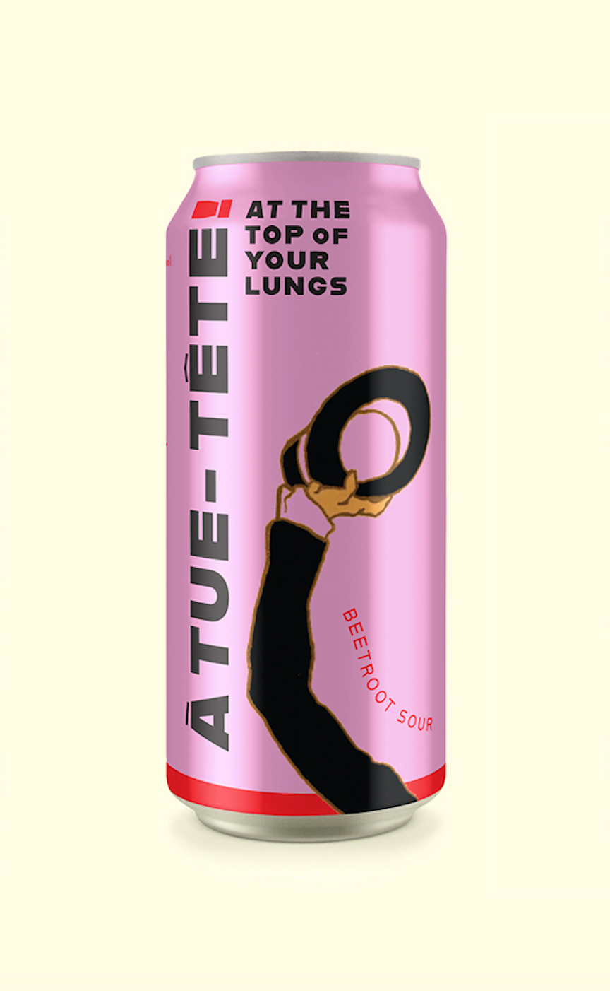
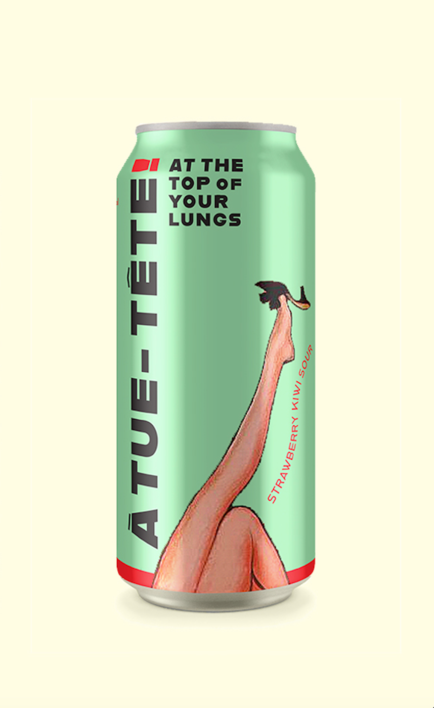
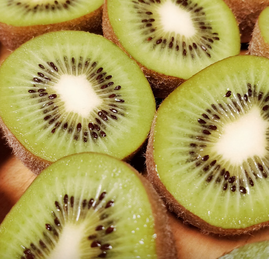
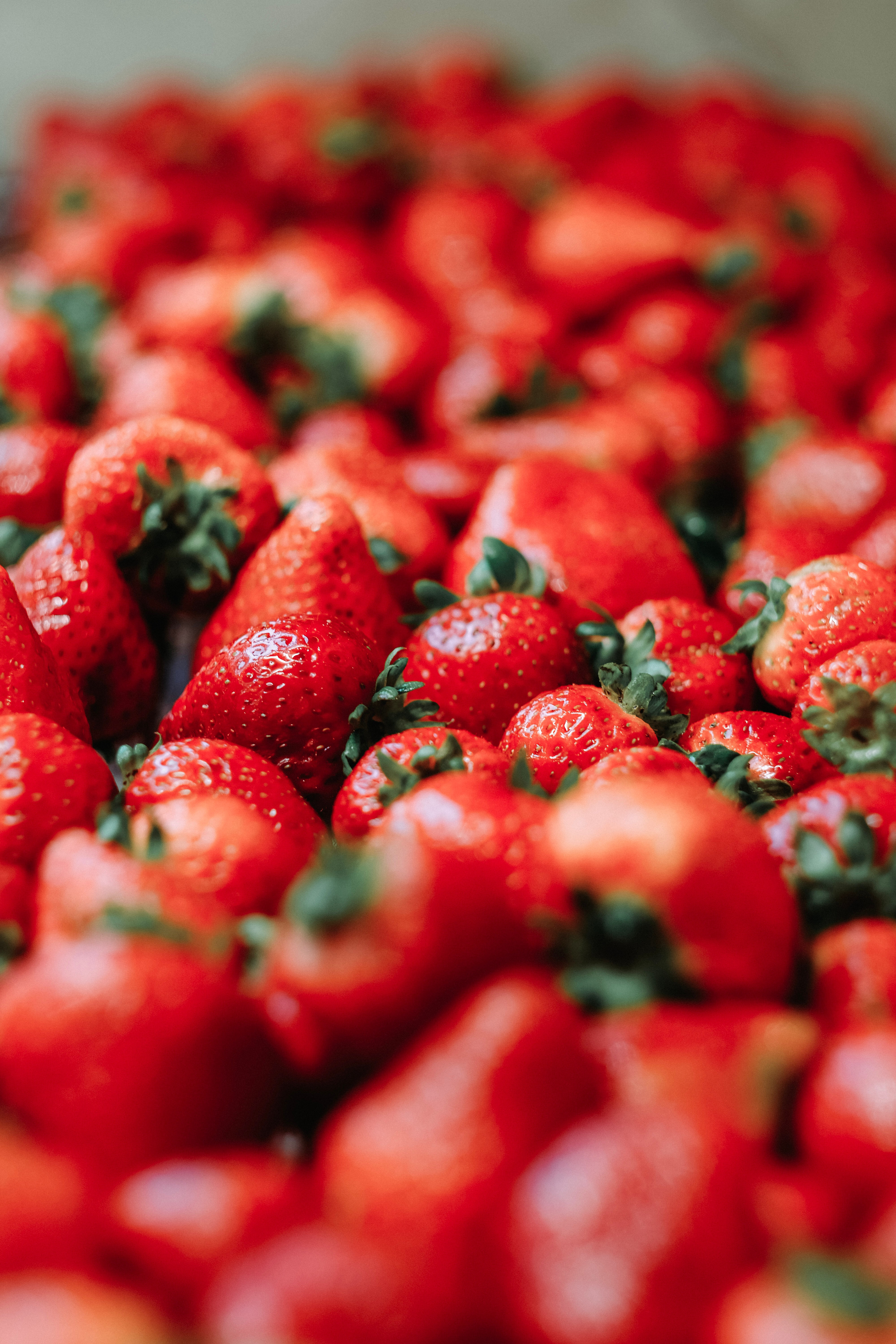
Their story begins with a passion for the bold and a desire to craft beers that resonate with the grandeur spirit of their home in the Swiss Alps. French for “at the top of your lungs”, À tue-tête! Brewery invites their brew enthusiasts to savor life's moments with exuberance, especially in the presence of a great view. Their sour ales are best described as a mix of beer and wine, fermented with peculiar ingredients like habanero peppers, beets, and even the pits of apricots. The brewery also defies the conventional with their labeling approach. Instead of adhering to one specific label, each batch receives its own distinctive and crafted design. Community outsourcing is another important factor to ÀTT’s process. By gathering their ingredients from local fruit-growers and working with local illustrators to create labels, the brewery stands as a breath of fresh air to their supporters.
Approach
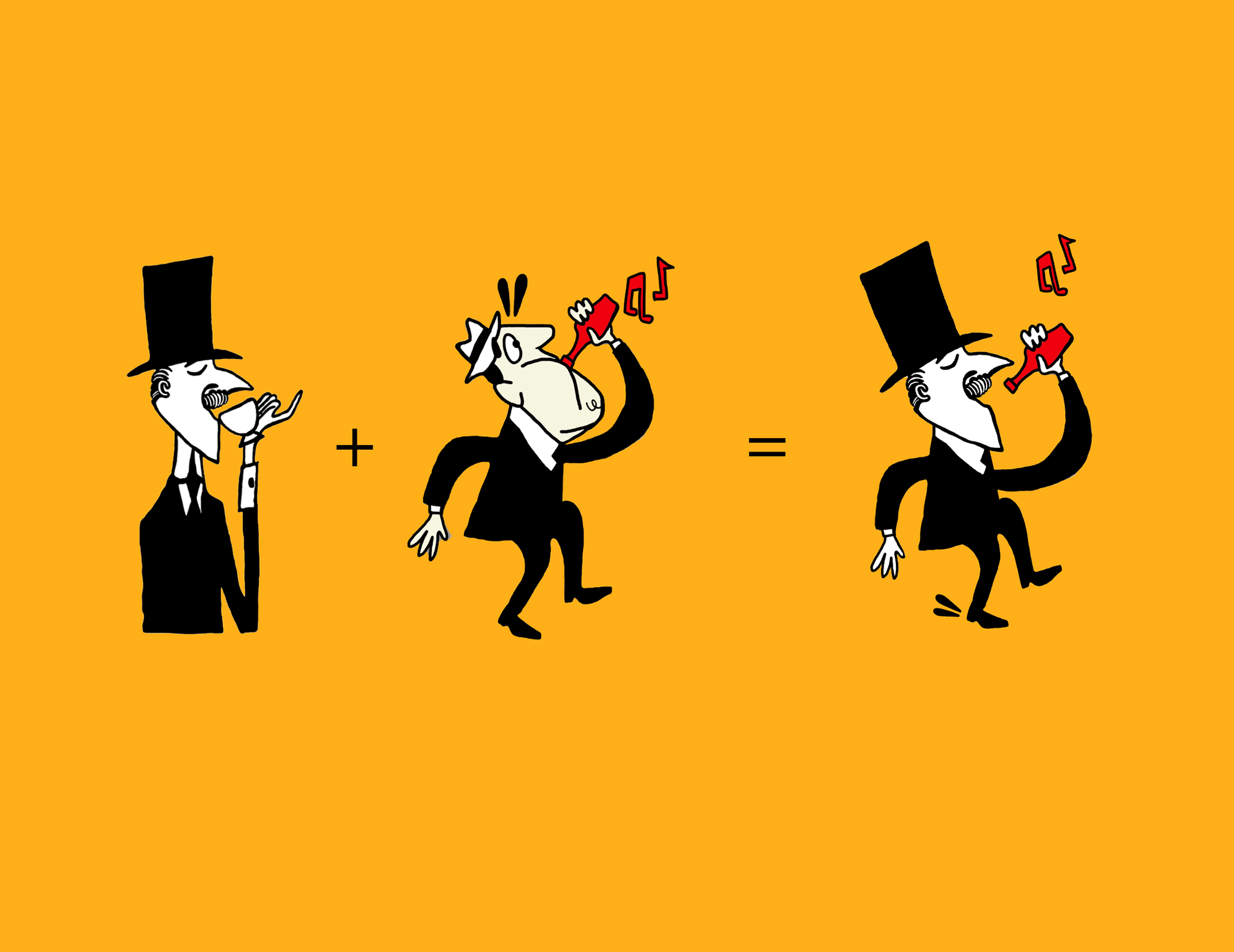
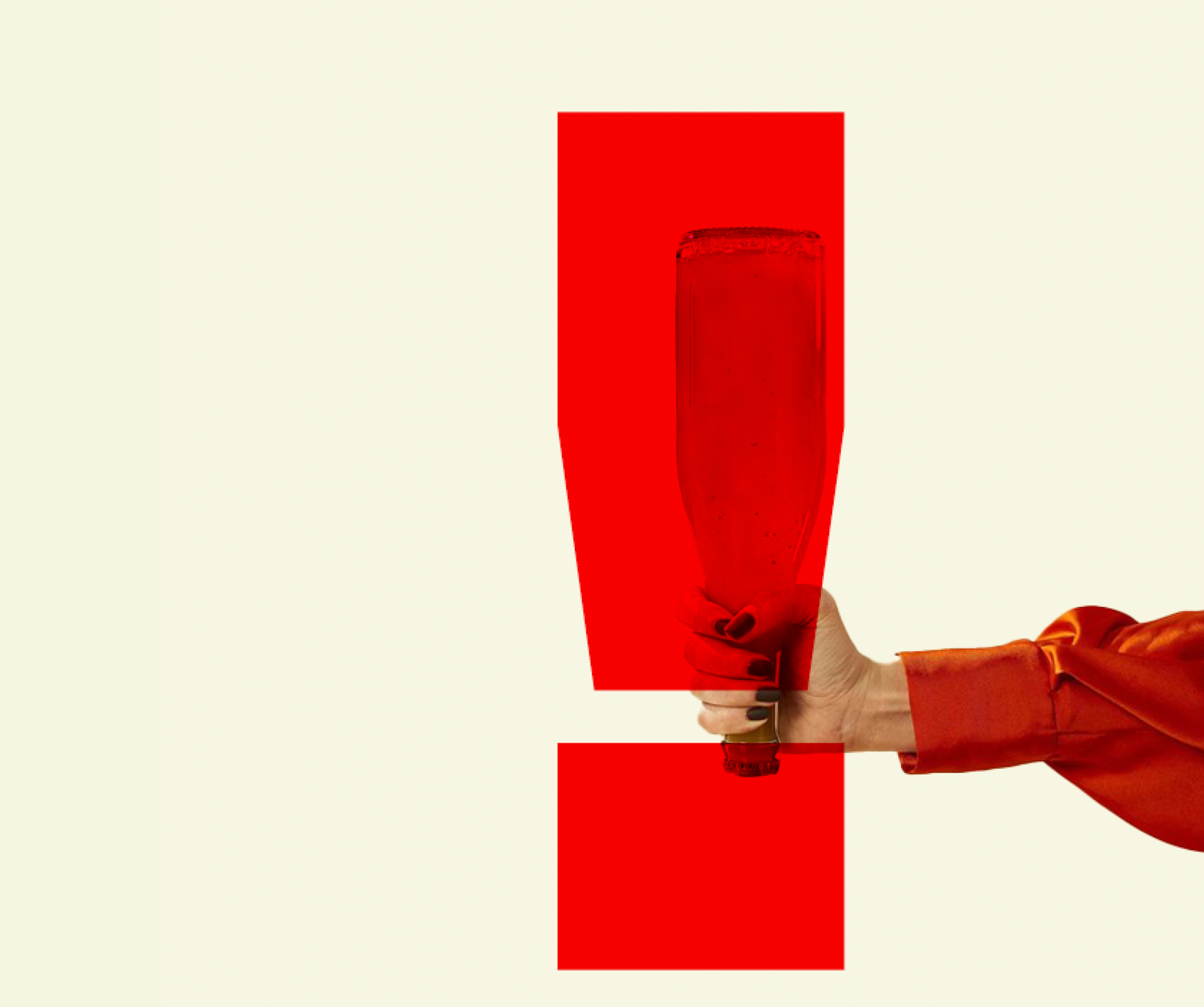
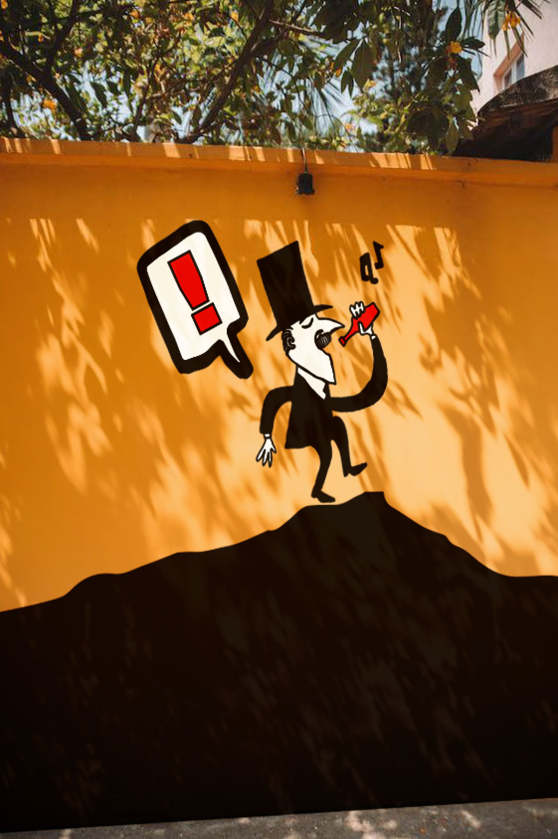
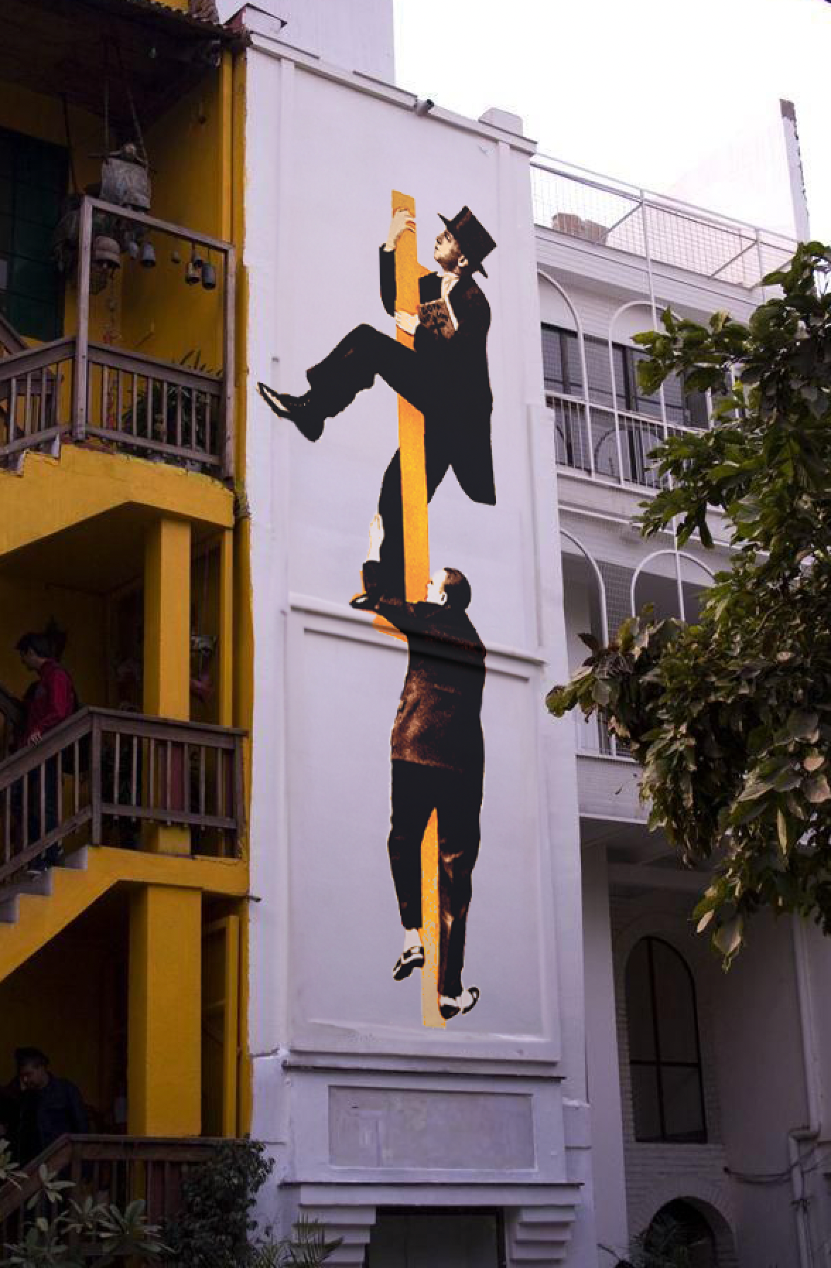
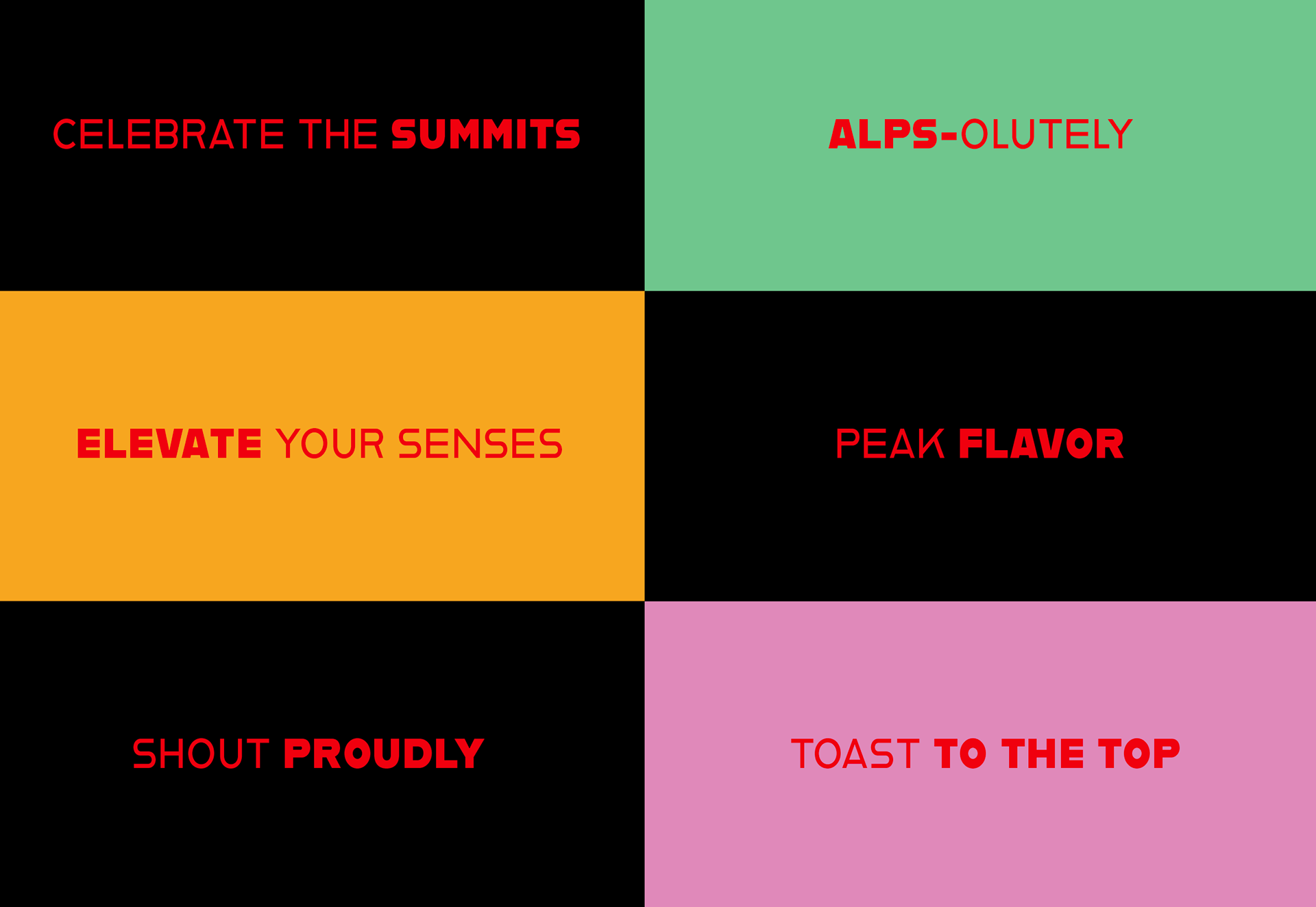
When searching for small breweries around the world that were less established, what stuck out about ÀTT the most was their minimal approach to packaging labels and how widely their designs varied. Not to mention, their sour ales are packaged in bottles that are more commonly seen used for wine. But, hey, who doesn’t love a bold departure from the ordinary from time to time? Keeping in mind my initial reaction towards the brand, I thought ‘why discard what was eye-catching in the first place?’ So, in crafting the redesign for ÀTT, I sought to elevate the brewery’s existing creative expression and pay tribute to their rich tradition of creating unique individual labels, as well as offering an additional canned product line. Introducing a mascot was a deliberate choice to personify the brand, create a playful narrative, and act as a visual anchor to tie together the diverse range of labels while echoing À tue-tête! Brewery’s bold presence.
Proposed Trademark(s)
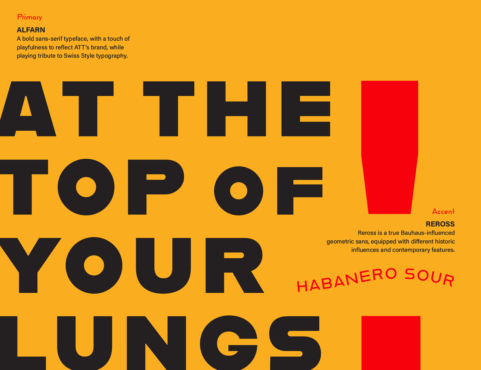
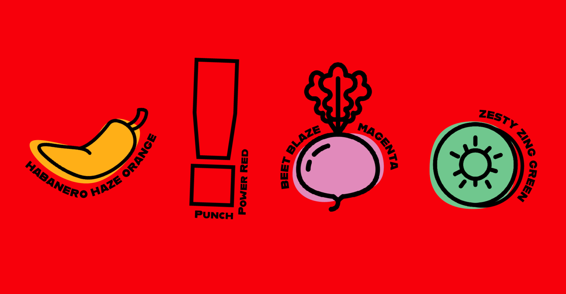
Typography & Color Palette

Morphological Character Design