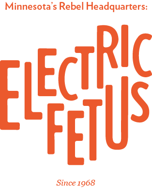
Electric Fetus Record Store
Branding/Trademark Design
Overview
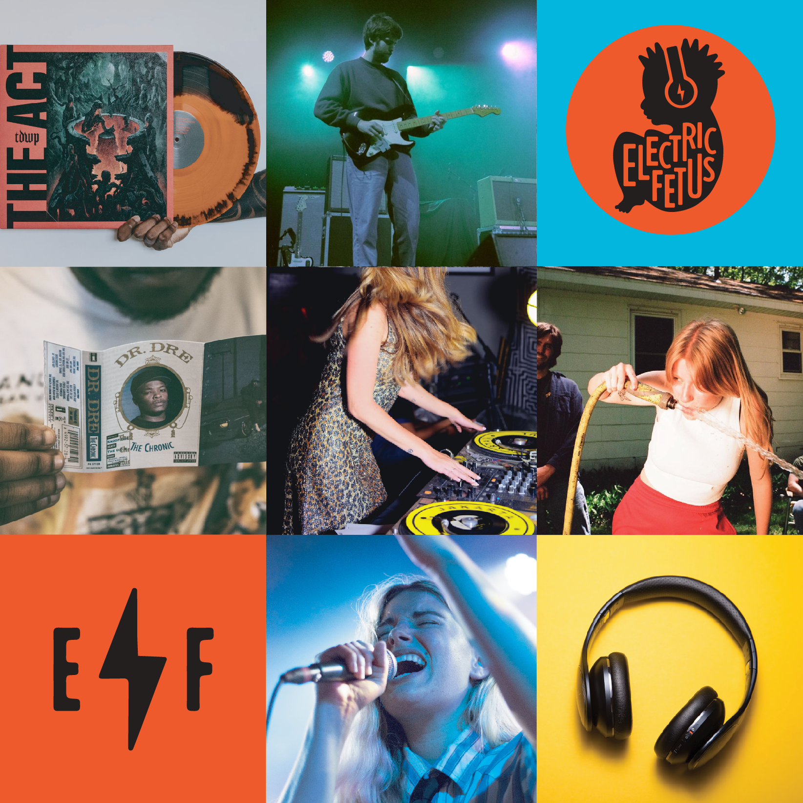
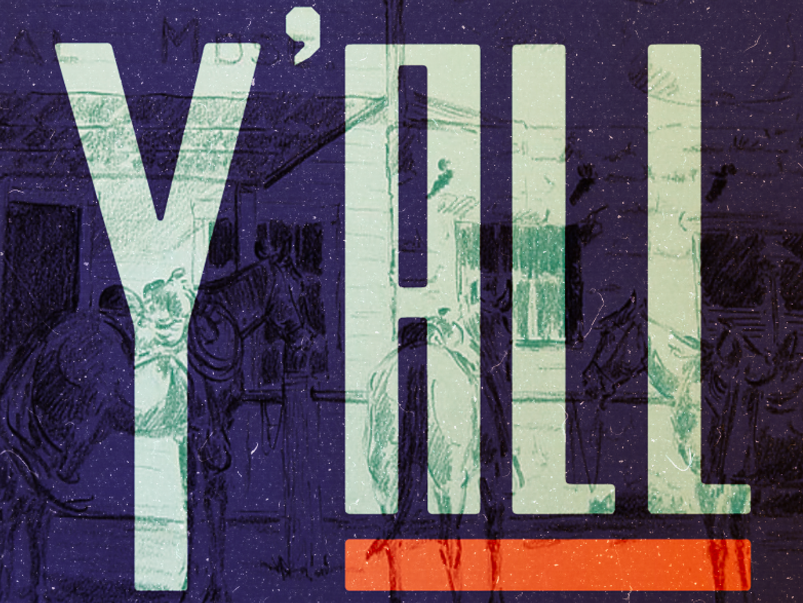
No one quite remembers the origin story of how the record store landed on the name “Electric Fetus”— Still, somehow, the name makes perfect sense. Founded by four friends in the heart of Minneapolis, Minnesota, Electric Fetus has been making waves in the music business since 1968. The business continues its commitment to promoting cool music and fostering an intimate connection between artists and the community. Along with their extensive vinyl collection, EF hosts live events, workshops, and signings from rising artists to renowned icons.
Approach
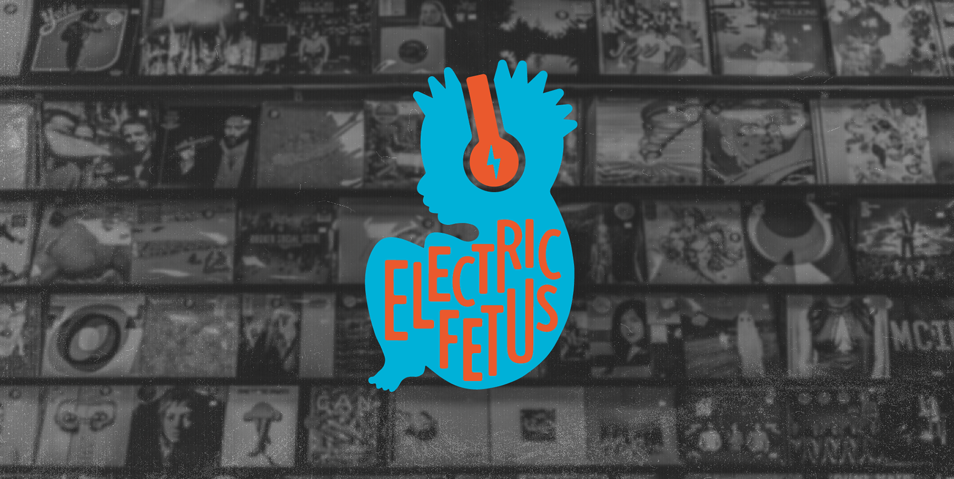
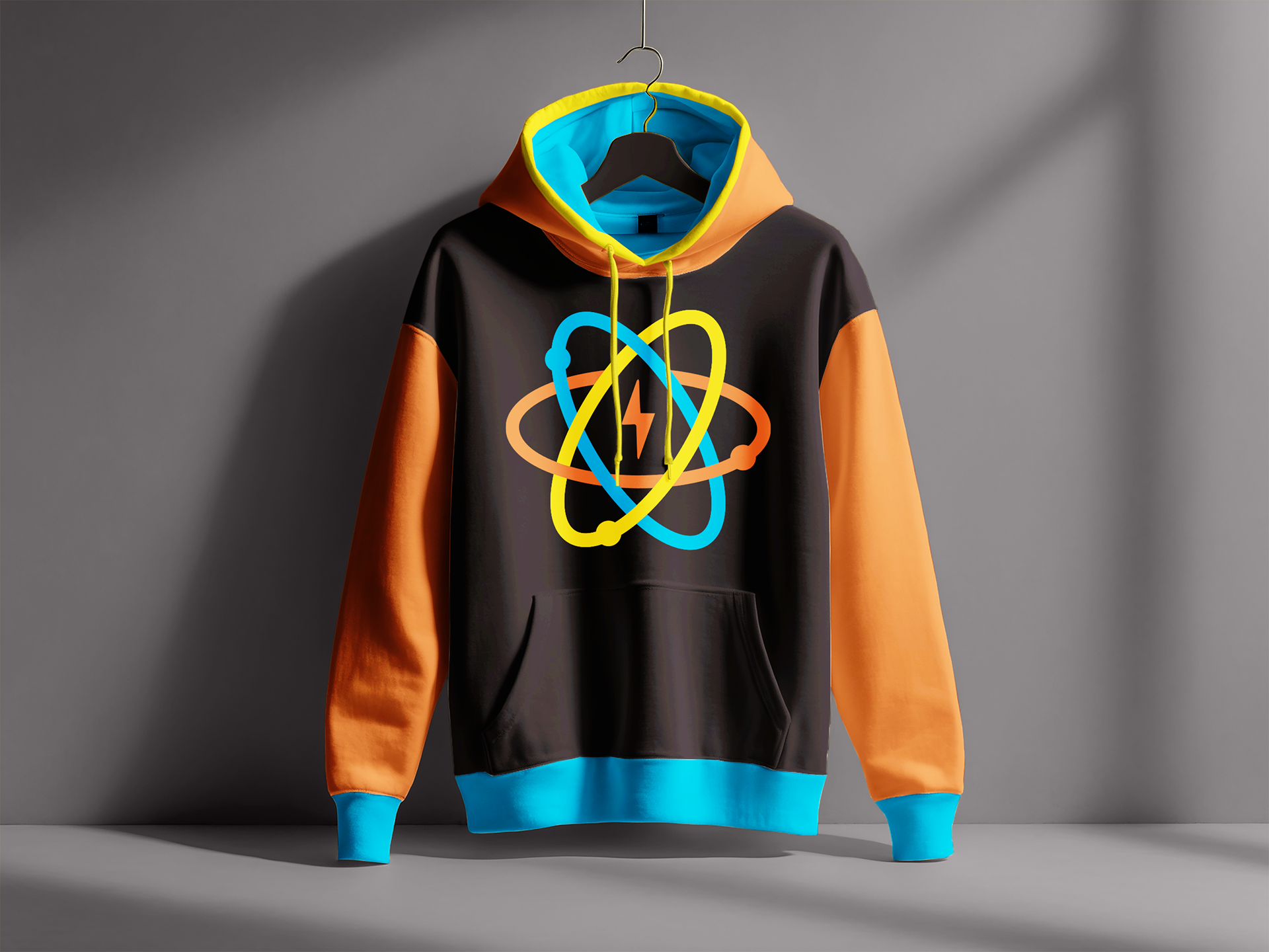
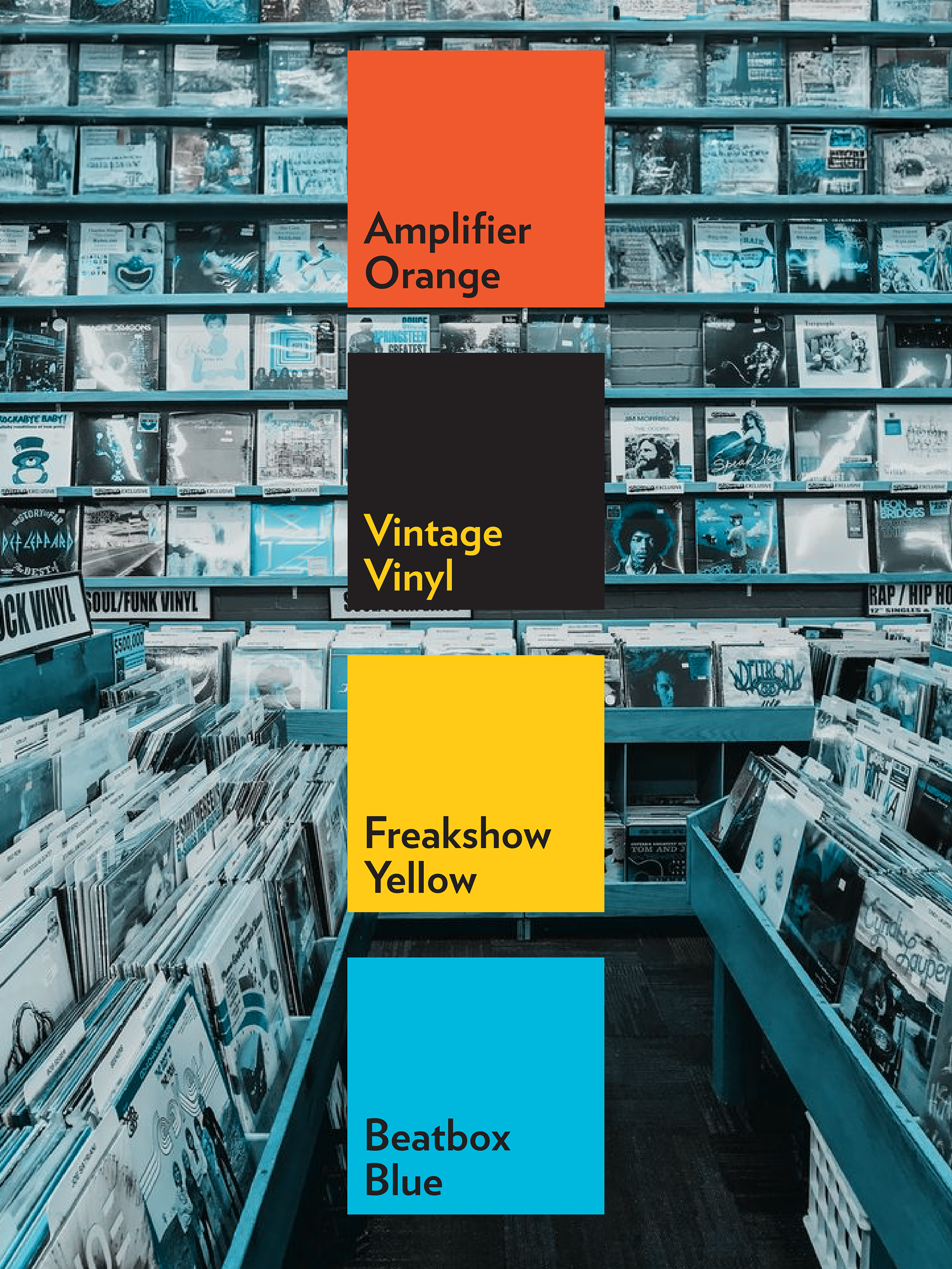
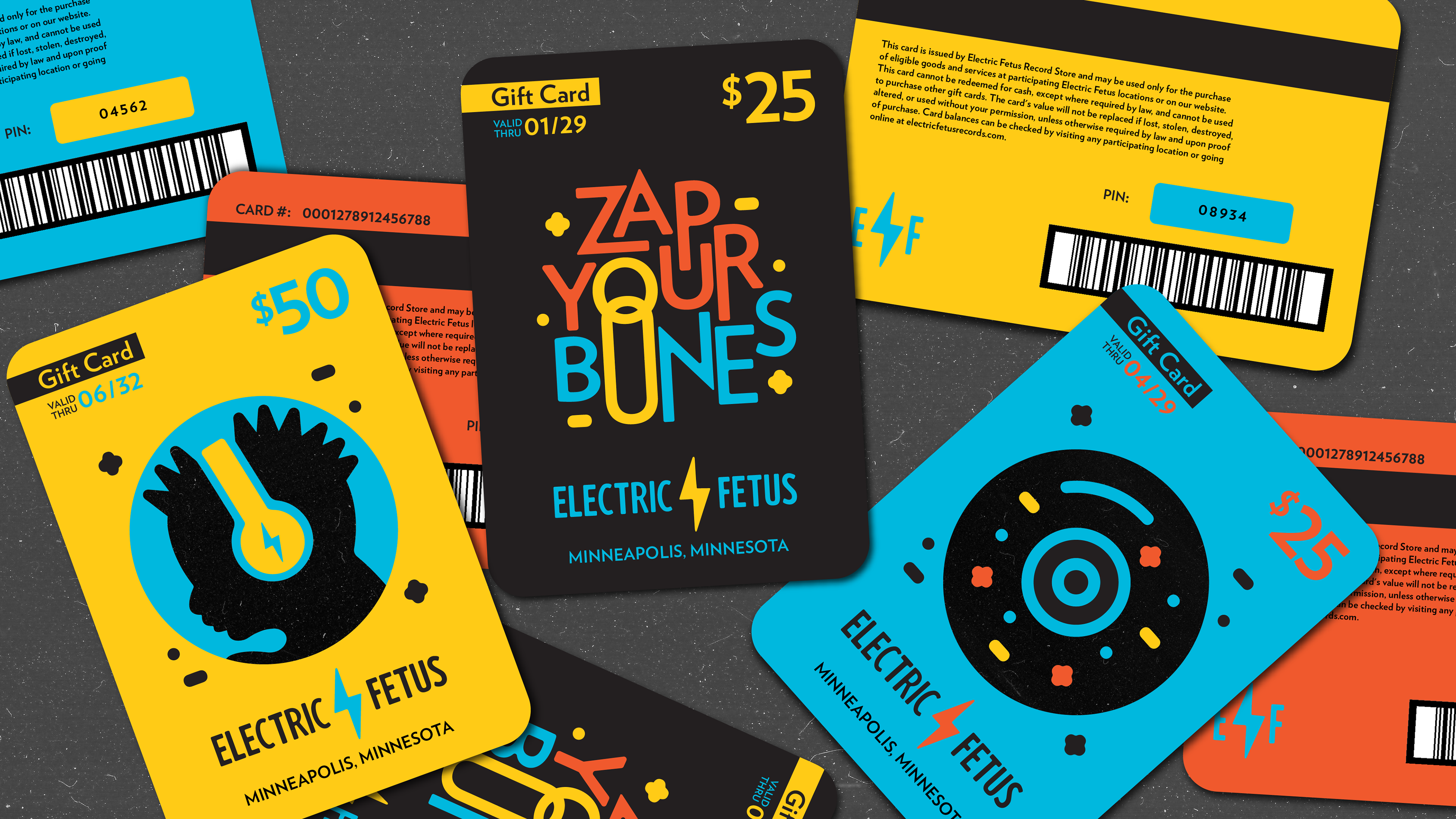
The goal was to design a trademark that complimented the store's unique moniker and made a memorable connection with the community. With a name like Electric Fetus, there was no shortage of ideas for visual representation. By revamping EF’s trademark through the use of playful, custom typography and colors that vibrate, the store now has an image that stands up to it’s name.


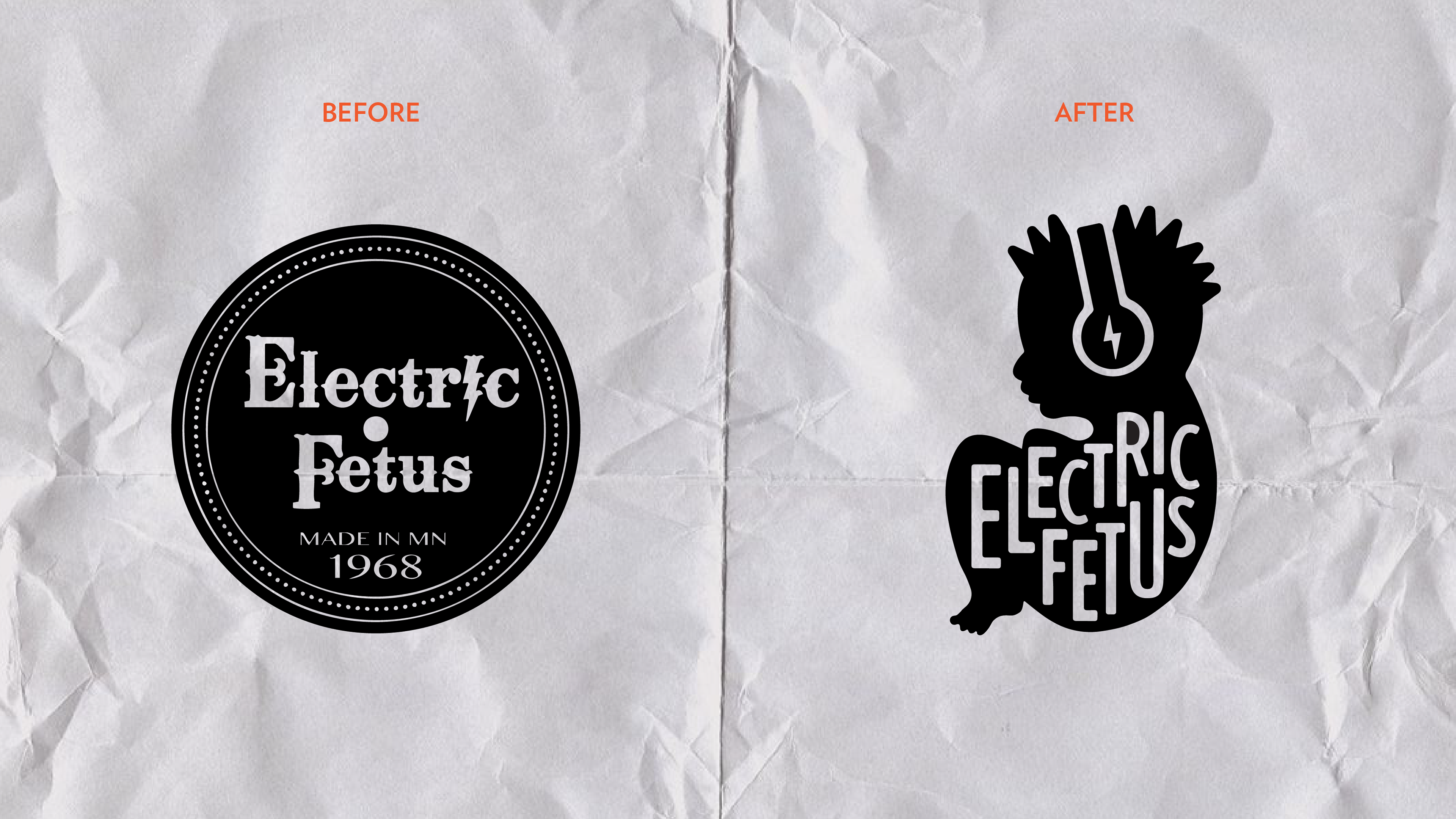
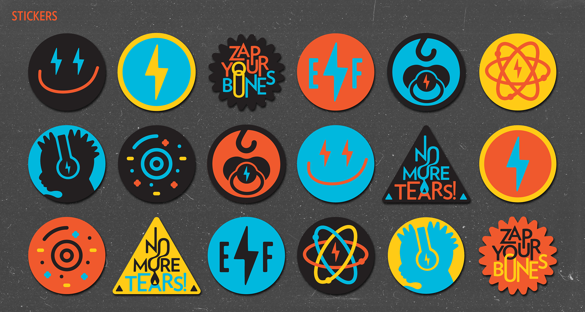
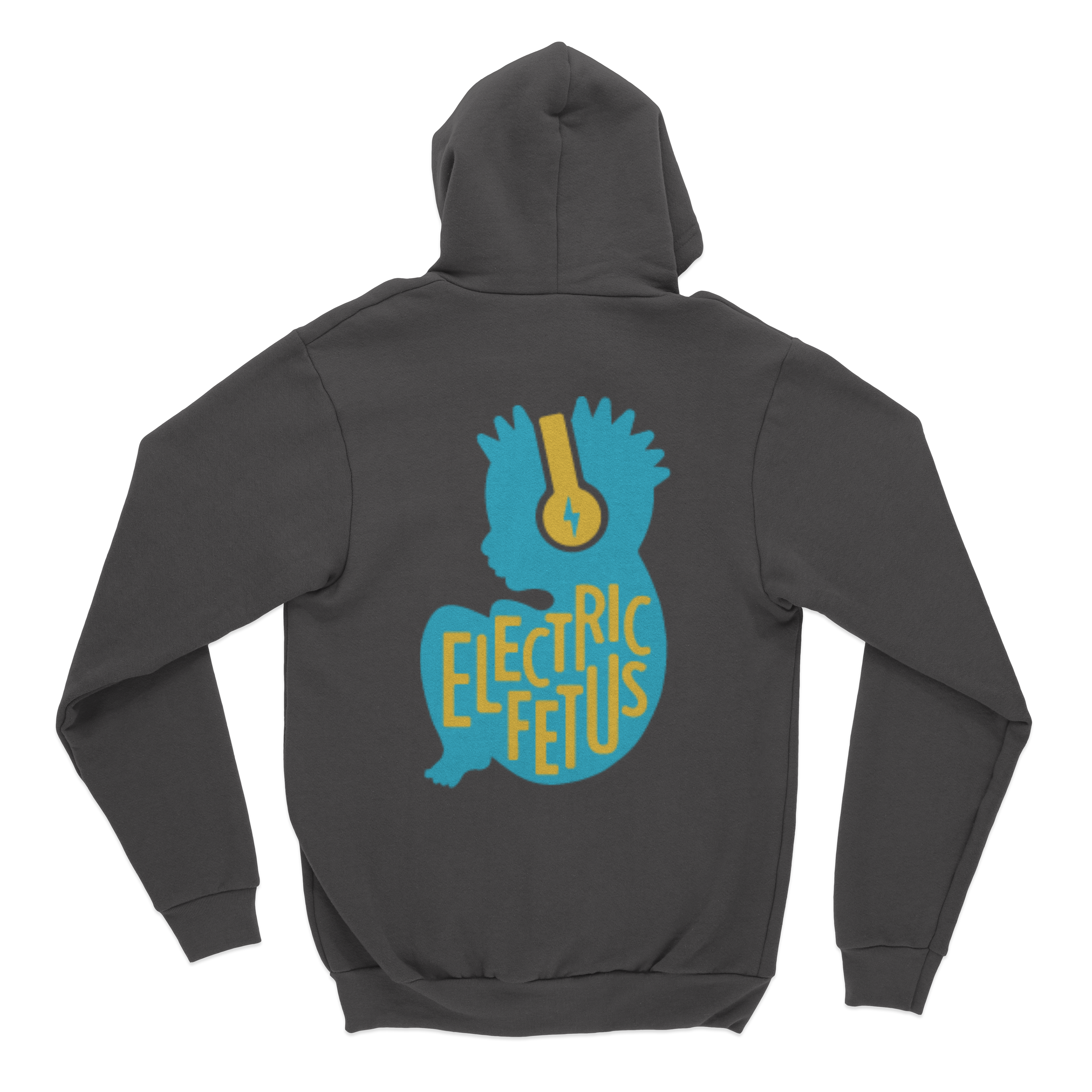
Wired for Sound
Electric Fetus's original logo didn't reflect it's lively spirit. Choosing vibrating color combinations and implementing custom typography, helped give EF the fresh, modern rebrand that it deserved. As far as the baby with a mohawk, listening to music? Now, that's just pure defiance.


Musical Royalty
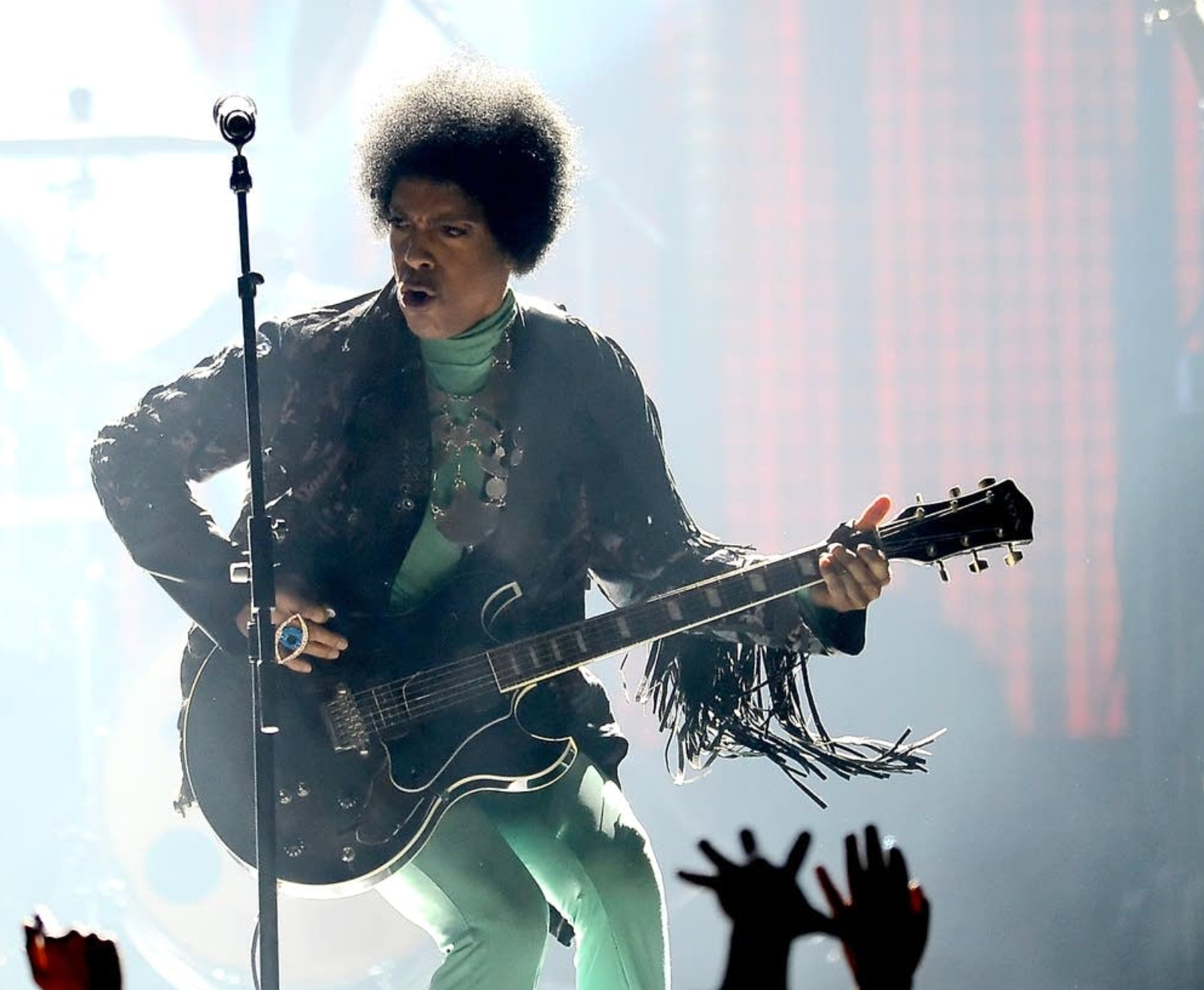
Prince Rogers Nelson, an icon renowned for transcending musical boundaries, was a long-standing fan and visitor of Electric Fetus, symbolizing the store's profound influence and connection within the music industry.